



Top Power BI Dashboard Templates for 2026
Posted on September 24, 2026

Contents
Building a Power BI dashboard from scratch can take considerable time, especially when you need to organize data, select meaningful KPIs, and create a layout that business users can understand quickly. The right Power BI dashboard template gives you a structured starting point for transforming raw data into actionable business insights.
Whether you are a business analyst, finance manager, sales leader, or entrepreneur, a well-designed dashboard can help you monitor performance, identify trends, and make informed decisions without manually reviewing spreadsheets.
In this guide, we explore the top Power BI dashboard templates for 2026, including sales, finance, marketing, HR, supply chain, healthcare, and executive dashboards. You'll also learn which KPIs to include, how to select the right template, and where to find free Power BI dashboard templates to accelerate your reporting workflow.
What Is a Power BI Dashboard Template?
A Power BI dashboard template is a pre-designed reporting structure that includes layouts, visual elements, charts, KPI cards, filters, and sometimes data models or sample datasets.
Instead of starting with a blank Power BI canvas, you can use a template to organize your reporting requirements and customize the design according to your business needs.
Depending on the source, Power BI templates may include:
- Pre-designed dashboard layouts
- Sample data and example visualizations
- KPI cards and performance indicators
- Interactive charts and slicers
- Report pages organized by business function
- Reusable design structures
Some templates focus primarily on visual design, while others include reusable Power BI report structures or .pbit files. A design template is not necessarily a complete working report, so always check what is included before downloading.
Why Use Power BI Dashboard Templates in 2026?
Businesses increasingly rely on data from multiple sources, including CRM platforms, advertising tools, financial software, ERP systems, and spreadsheets.
A dashboard template can help teams:
-
Reduce the time spent planning report layouts.
-
Standardize reporting across departments.
-
Present important KPIs in a consistent format.
-
Improve collaboration between analysts and stakeholders.
-
Create a reusable foundation for future reports.
However, a visually attractive dashboard is only useful when it answers specific business questions.
1. Sales Dashboard Template
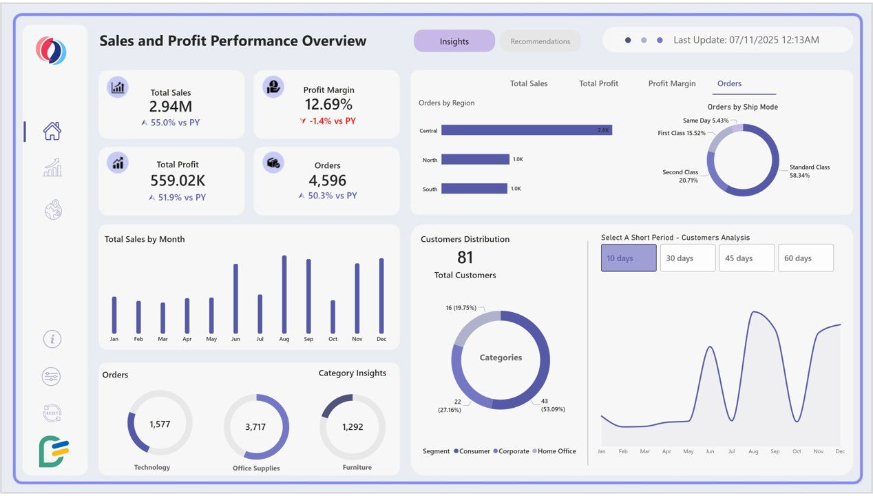
A Sales Power BI dashboard is one of the most useful Power BI templates for organizations that need to track revenue, sales targets, customer performance, and product trends.
Sales managers can use this dashboard to understand whether the team is meeting targets and which products, regions, or sales representatives are contributing to business growth.
Essential KPIs for a Sales Dashboard
| KPI | What It Measures |
| Total Revenue | Overall sales generated |
| Sales Growth Rate | Change compared with a previous period |
| Sales Target Achievement | Progress against assigned targets |
| Number of Orders | Total completed orders |
| Average Order Value | Average revenue per order |
| Gross Profit Margin | Profitability of sales |
| Top-Performing Products | Products generating the most revenue |
| Regional Sales | Performance by location |
Example: How a Sales Team Can Use This Template
Imagine an electronics distributor with sales across Mumbai, Pune, Delhi, and Bengaluru.
The sales manager notices that total revenue is increasing, but one region is consistently missing its monthly target. By using regional filters, product-level analysis, and monthly sales trends, the manager can investigate the issue and adjust sales strategies.
Recommended visuals:
-
Revenue KPI cards
-
Monthly revenue line chart
-
Regional sales bar chart
-
Product performance table
-
Target versus actual chart
-
Sales representative leaderboard
If you are planning a sales report but are unsure how to structure your KPIs and visuals, explore DataFlip for Power BI dashboard templates that can help you organize sales data into a practical reporting structure.
2. Financial Dashboard Template
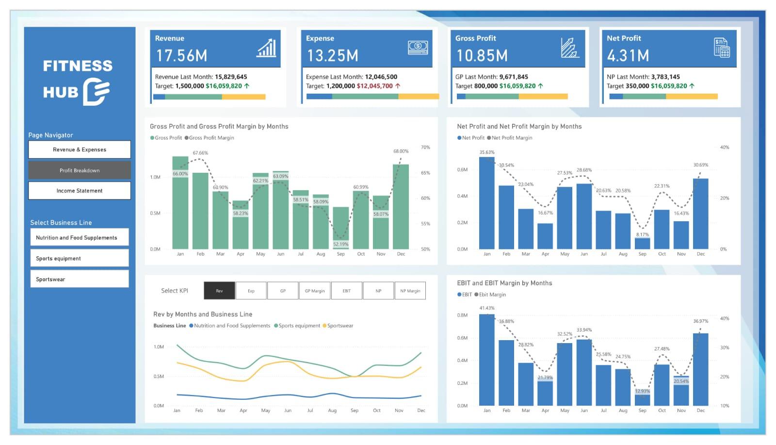
Financial dashboards help businesses monitor income, expenses, profitability, and cash flow in one centralized report.
Instead of reviewing multiple spreadsheets, finance teams can use a Power BI dashboard to identify changes in financial performance and compare actual results against budgets.
Essential KPIs for a Finance Dashboard
- Total Revenue
- Operating Expenses
- Net Profit
- Gross Profit Margin
- EBITDA
- Cash Flow
- Accounts Receivable
- Accounts Payable
- Budget Variance
Consider a growing consulting company with increasing revenue but rising operational expenses.
A finance dashboard can help management compare monthly revenue and expenses, identify cost increases, and evaluate whether profitability is improving.
For example, the dashboard could show:
| Metric | Current Month |
| Revenue | ₹25,00,000 |
| Operating Expenses | ₹15,00,000 |
| Net Profit | ₹10,00,000 |
Illustrative figures for explaining dashboard functionality, not actual company financial data.
Recommended Visuals
- Revenue and expense trend chart
- Profitability KPI cards
- Budget versus actual comparison
- Expense category breakdown
- Cash flow trend
- Monthly profit and loss table
A useful finance dashboard should prioritize accuracy and clarity over excessive visual elements.
3. Marketing Dashboard Template
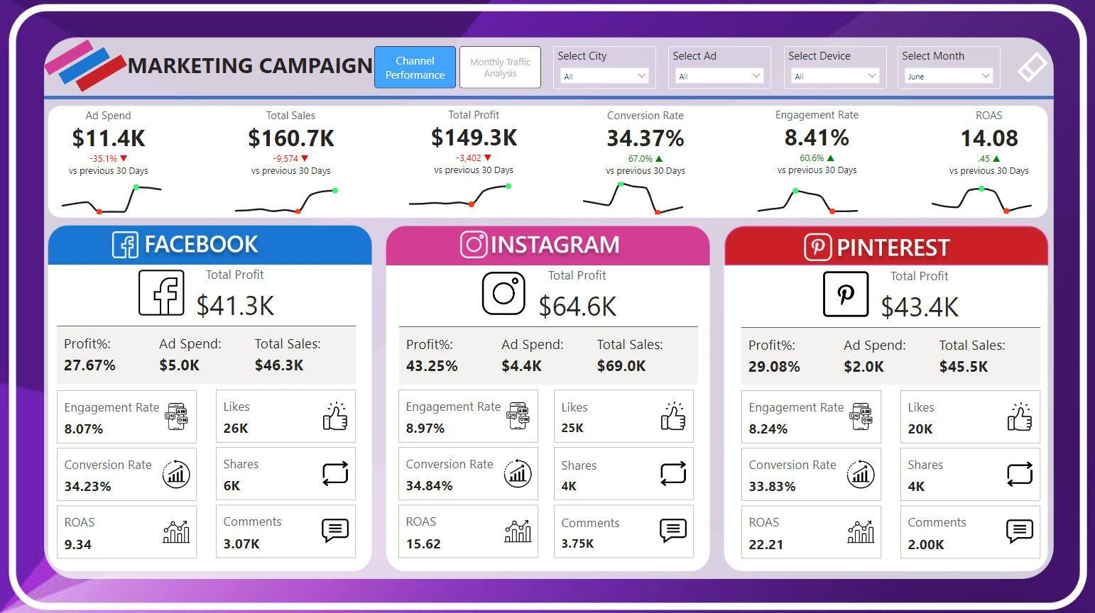
Marketing teams manage data from multiple channels, including Google Ads, Meta Ads, email marketing, organic search, and social media.
A Power BI marketing dashboard brings these metrics together, helping marketers understand campaign performance and evaluate how marketing investments contribute to business results.
Essential KPIs for a Marketing Dashboard
| KPI | Purpose |
| Impressions | Measures ad visibility |
| Clicks | Tracks user engagement |
| Click-Through Rate | Measures the percentage of impressions resulting in clicks |
| Cost Per Click | Tracks average advertising cost per click |
| Conversion Rate |
Measures the percentage of users completing a desired action
|
| Cost Per Acquisition | Measures the cost of acquiring a conversion |
| Return on Ad Spend | Compares advertising revenue with ad spend |
| Marketing Qualified Leads | Tracks leads meeting defined qualification criteria |
Example: Comparing Google Ads and Meta Ads
Suppose an ecommerce company runs campaigns on Google Ads and Meta Ads.
Its marketing dashboard compares:
- Advertising spend by platform
- Leads and purchases
- Cost per conversion
- Revenue attributed to campaigns
- Campaign-level performance
The marketing manager can then investigate which campaigns generate the desired outcomes.
Important: Attribution depends on tracking setup, conversion definitions, and reporting windows. A dashboard should not automatically treat platform-reported conversions as directly comparable without reviewing these differences.
Recommended Visuals
- Channel performance comparison
- Campaign spend versus conversions
- ROAS by campaign
- Conversion funnel
- Monthly marketing performance
- Geographic campaign analysis
Looking for a structured starting point for your marketing reporting? Visit DataFlip to explore dashboard templates designed to organize business data into clear, decision-focused reports.
4. HR Analytics Dashboard Template
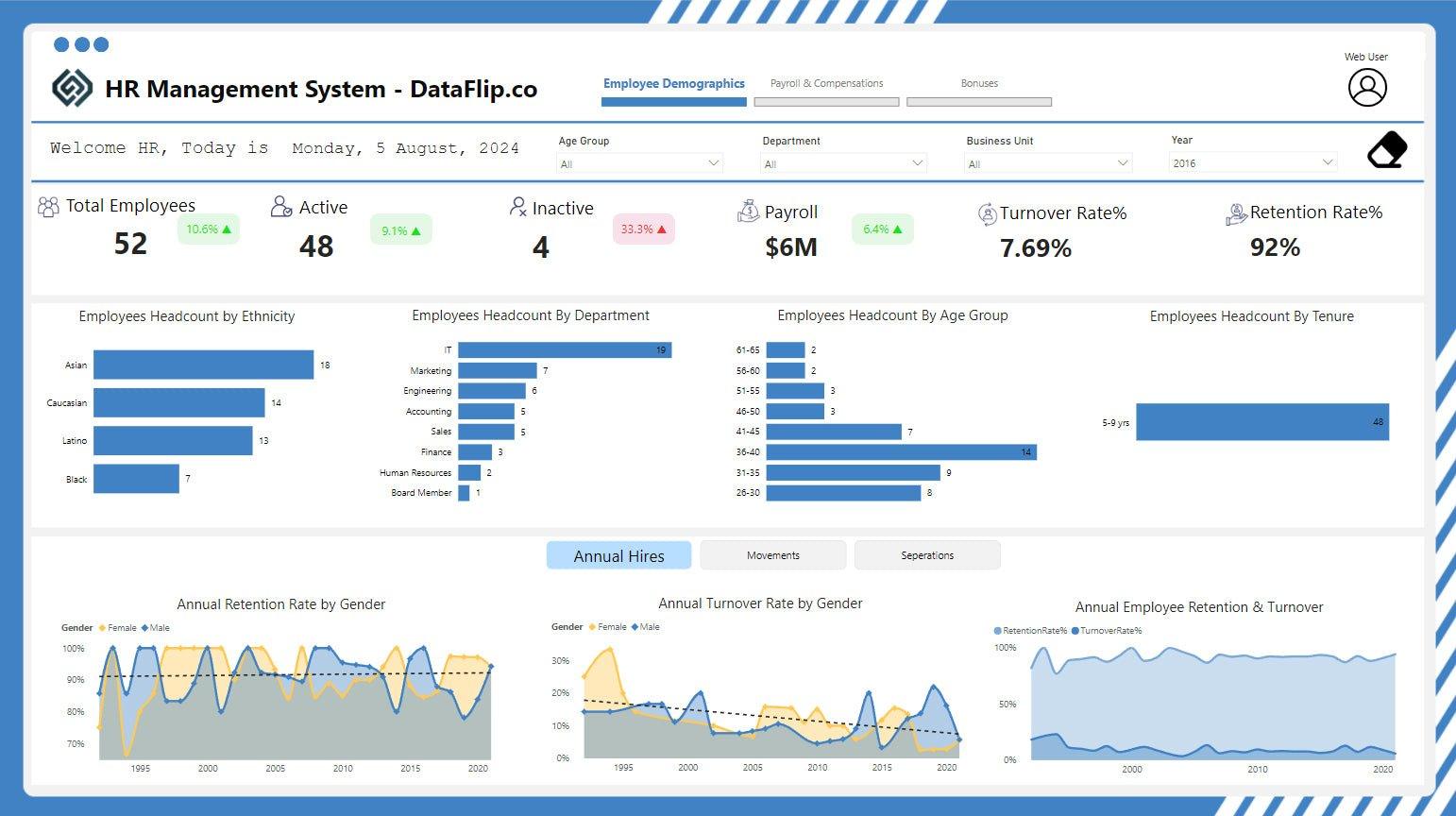
HR analytics dashboards help organizations understand workforce trends, employee retention, recruitment activity, and staffing costs.
Rather than maintaining separate spreadsheets for employee data, HR teams can use Power BI to create interactive reports for workforce planning.
Essential KPIs for an HR Dashboard
- Total Employees
- New Hires
- Employee Attrition Rate
- Average Employee Tenure
- Absence Rate
- Recruitment Cost
- Time to Hire
- Open Positions
- Department-Wise Headcount
Example: Identifying Employee Attrition
Imagine a company with 500 employees that notices higher employee turnover in its customer support department.
An HR dashboard can help analyze attrition by:
- Department
- Job role
- Tenure
- Location
- Hiring period
This information can support further investigation into workforce planning and employee retention.
Recommended Visuals
- Headcount by department
- Employee attrition trend
- Recruitment funnel
- Employee tenure distribution
- Gender or demographic breakdown, where appropriate and lawfully handled
- Department-level staffing comparison
HR dashboards should use appropriate access controls because employee information may be confidential.
5. Supply Chain and Inventory Dashboard Template
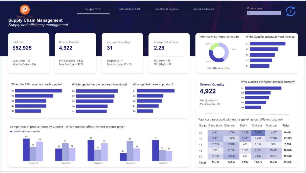
Supply chain dashboards help businesses monitor inventory, procurement, supplier performance, and logistics operations.
For companies managing multiple warehouses or product categories, a centralized Power BI report can make it easier to identify stock-related issues.
Essential KPIs
| KPI | Business Use |
| Inventory Turnover | Measures how frequently inventory is sold and replenished |
| Stock on Hand | Shows available inventory |
| Stockout Rate | Tracks product availability issues |
| Supplier Lead Time | Measures time taken to receive supplies |
| Order Fulfillment Rate | Tracks completed orders |
| Inventory Value | Measures capital tied up in stock |
| Purchase Order Status | Monitors procurement progress |
A retail business discovers that popular products frequently go out of stock during weekends.
By analyzing historical sales, inventory levels, and supplier lead times, the operations team can improve replenishment planning.
Recommended Visuals
- Inventory level trend
- Warehouse stock comparison
- Supplier performance table
- Low-stock alerts
- Purchase order tracking
- Product movement analysis
A supply chain dashboard should support timely operational decisions, not simply display inventory numbers.
6. Executive Management Dashboard Template

Executive dashboards provide leadership teams with a high-level overview of organizational performance.
Unlike department-specific reports, executive dashboards typically combine financial, sales, operational, and customer metrics into a concise summary.
Essential KPIs
- Total Revenue
- Revenue Growth
- Net Profit
- Customer Acquisition
- Customer Retention
- Sales Target Achievement
- Operational Performance
- Business Unit Performance
Example: Monthly Executive Review
A company director opens the dashboard during a monthly management meeting.
The report shows:
- Revenue compared with the previous month
- Profit margin trends
- Sales performance by business unit
- Customer acquisition results
- Operational bottlenecks
The leadership team can then investigate areas requiring attention without reviewing multiple departmental reports individually.
Recommended Visuals
- KPI summary cards
- Revenue and profit trends
- Business unit comparison
- Target versus actual chart
- Performance summary table
- Interactive date and department filters
Design tip: Executive dashboards should focus on the metrics that support leadership decisions. Too many charts can make an overview difficult to interpret.
7. Customer Analytics Dashboard Template

Customer analytics dashboards help businesses understand purchasing behavior, customer retention, satisfaction, and customer value.
These templates are particularly useful for ecommerce companies, subscription businesses, retailers, and customer-focused service providers.
Essential KPIs
- Total Customers
- New Customers
- Repeat Purchase Rate
- Customer Retention Rate
- Customer Lifetime Value
- Average Order Value
- Customer Churn Rate
- Customer Acquisition Cost
Example: Understanding Customer Retention
An online retailer notices that many customers make only one purchase.
Using a customer analytics dashboard, the business can segment customers by purchase frequency, location, product category, and order value.
This analysis can help identify opportunities for customer retention initiatives.
Recommended Visuals
- New versus returning customers
- Customer segmentation
- Repeat purchase trends
- Customer lifetime value analysis
- Retention cohort chart
- Purchase frequency distribution
Definitions matter here. For example, customer retention and repeat purchase rate are related but not identical metrics.
8. Healthcare Analytics Dashboard Template
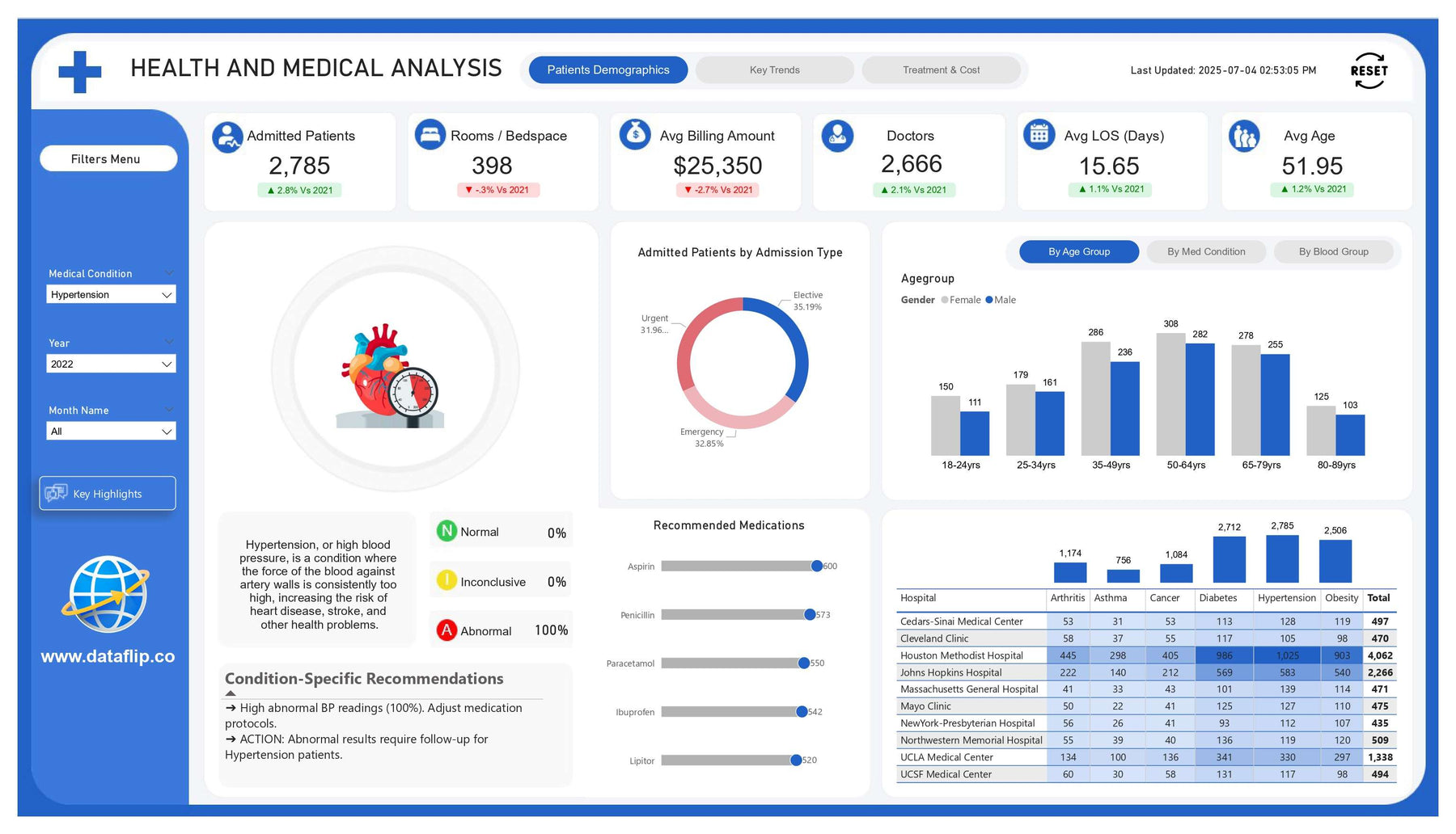
Healthcare organizations can use Power BI dashboards to monitor operational and administrative performance.
These dashboards may support hospitals, clinics, diagnostic centers, and healthcare management teams.
Essential KPIs
- Total Patient Visits
- Appointment Volume
- Appointment Cancellation Rate
- Average Waiting Time
- Bed Occupancy Rate
- Revenue by Department
- Diagnostic Test Volume
- Patient Satisfaction Score
Example: Monitoring Hospital Operations
A hospital administrator wants to understand why patient waiting times are increasing in the outpatient department.
A dashboard can compare appointment volumes, department-level activity, and average waiting times over different periods.
This helps management identify operational patterns for further investigation.
Recommended Visuals
- Patient visit trends
- Department performance
- Appointment status breakdown
- Waiting time analysis
- Revenue by service category
- Monthly operational summary
Healthcare dashboards require careful attention to patient privacy, data security, and access permissions. Sensitive patient information should only be displayed to authorized users.
9. Project Management Dashboard Template

Project management dashboards help teams monitor project progress, resource allocation, budgets, and deadlines.
They are useful for agencies, consulting firms, IT companies, and organizations managing multiple projects simultaneously.
Essential KPIs
- Total Active Projects
- Completed Projects
- Project Completion Rate
- Tasks Overdue
- Budget Utilization
- Resource Allocation
- Project Profitability
- Average Project Duration
Example: Monitoring Project Delivery
A digital agency manages 20 active client projects.
Its project dashboard shows:
- Projects approaching deadlines
- Pending tasks
- Team workload
- Budget utilization
- Project completion status
Project managers can use these insights to prioritize tasks and coordinate resources.
Recommended Visuals
- Project status cards
- Gantt-style timeline
- Task completion chart
- Resource utilization
- Budget versus actual
- Project performance table
How to Choose the Right Power BI Dashboard Template
Not every Power BI dashboard template is suitable for every business. The right choice depends on your reporting requirements, data structure, and intended users.
Consider the following factors before selecting a template.
1. Define Your Business Objective
Start by identifying what the dashboard should help you understand.
For example:
-
Sales dashboard: Are we meeting revenue targets?
-
Finance dashboard: Are expenses increasing faster than revenue?
-
HR dashboard: Which departments have high attrition?
-
Marketing dashboard: Which campaigns generate qualified leads?
A clear objective helps you avoid adding unnecessary visuals.
2. Check KPI Availability
A template may look impressive but become difficult to use if your data does not support its KPIs.
Before selecting a template, verify that you have access to the required data sources and fields.
3. Evaluate Layout and Readability
Look for dashboards with:
- Clear visual hierarchy
- Consistent spacing
- Logical grouping of metrics
- Easy-to-read labels
- Appropriate chart selection
- Useful filtering options
A dashboard should help users interpret information quickly.
4. Check Customization Options
Your business may require different branding, metrics, filters, and report pages.
Choose a template that can be adapted to your requirements instead of forcing your data into an unsuitable structure.
5. Understand What the Template Includes
Some resources provide only design inspiration. Others include Power BI report files, sample data, or reusable structures.
Always check:
- File format
- Data availability
- Required Power BI version
- Licensing conditions
- Customization options
- Whether the template includes a working data model
6. Consider Data Security
If your dashboard contains financial, employee, healthcare, or customer information, ensure that appropriate permissions and access controls are configured.
Where to Find Free Power BI Dashboard Templates in 2026
If you are looking for free Power BI dashboard templates, several resources can help you get started.
1. DataFlip
DataFlip provides dashboard-related resources for businesses and professionals looking for practical reporting solutions.
Useful for: Exploring business dashboard templates and identifying reporting ideas across different categories.
Explore DataFlip Templates
2. Microsoft Power BI Community
Microsoft Power BI Community is a useful place to find discussions, report examples, and guidance from Power BI users.
Useful for: Learning from community examples and troubleshooting report development questions.
3. Microsoft AppSource
Microsoft AppSource offers business applications and analytics-related solutions, including Power BI content.
Useful for: Exploring solutions and templates connected to business reporting requirements.
4. Dashboard Design and Wireframing Tools
Tools such as Mokkup.ai provide pre-built dashboard designs and wireframing capabilities for planning Power BI reports.
Mokkup's official resources describe templates for categories such as sales, marketing, finance, and operations, along with Power BI export capabilities. However, a wireframe or design export should not automatically be treated as a complete production-ready report.
Power BI Dashboard Design Best Practices for 2026
A template provides a starting point, but the final dashboard should be designed around how users consume information.
Keep the Most Important KPIs at the Top
Place high-priority metrics where users can see them immediately.
For example, a sales dashboard may begin with:
- Total Revenue
- Revenue Growth
- Orders
- Average Order Value
Use the Right Chart for Each Metric
Different visuals serve different purposes.
| Business Requirement | Recommended Visual |
| Track changes over time | Line chart |
| Compare categories | Bar chart |
| Show a single KPI | Card |
| Analyze geographic performance | Map |
| Compare targets | Bullet or variance chart |
| Review detailed records | Table or matrix |
Avoid Overloading the Dashboard
Adding too many charts can make the report difficult to understand.
A focused dashboard with fewer relevant visuals is often more useful than a crowded report containing every available metric.
Design for Different Screen Sizes
Consider whether users will view the report on:
- Desktop monitors
- Laptops
- Large presentation screens
- Power BI mobile applications
The layout should remain readable across the intended viewing environments.
Include Filters That Support Real Questions
Useful slicers may include:
- Date
- Region
- Department
- Product Category
- Customer Segment
- Sales Channel
Only include filters that help users analyze the dashboard.
Use Consistent Colors and Formatting
Use a consistent visual language for:
- Revenue
- Costs
- Growth
- Warnings
- Targets
- Performance status
Color should support interpretation rather than distract from the data.
Frequently Asked Questions
1. What are the best Power BI dashboard templates for 2026?
The right template depends on your business requirements. Commonly used categories include sales, finance, marketing, HR, supply chain, executive, customer analytics, healthcare, and project management dashboards.
2. Where can I download free Power BI dashboard templates?
You can explore DataFlip, Microsoft Power BI Community, Microsoft AppSource, and other dashboard resource platforms. Check whether each resource provides a working Power BI file, a design template, or only sample visuals.
3. Can I customize a Power BI dashboard template?
Yes. Most reusable dashboard structures can be adapted with your own KPIs, branding, data sources, filters, and report pages, depending on the template format and licensing terms.
4. What is the difference between a Power BI dashboard and a Power BI report?
In everyday business discussions, these terms are often used interchangeably. Technically, Power BI reports are multi-page analytical documents, while Power BI dashboards are single-page canvases in the Power BI service that can display tiles from reports and other sources.
5. What KPIs should every Power BI dashboard include?
There is no universal KPI list. A useful dashboard should include metrics that directly support its business objective. For example, sales dashboards may focus on revenue and orders, while finance dashboards may prioritize profit, expenses, and cash flow.
6. Are Power BI dashboard templates suitable for beginners?
Yes. Templates can help beginners understand dashboard layouts, KPI organization, and visual selection. However, users still need to understand data preparation, relationships, calculations, and Power BI functionality to build reliable reports.
7. Can I use Excel data in a Power BI dashboard template?
Yes. Power BI supports importing data from Excel, provided the workbook structure and required fields are compatible with the report. You may need to transform or map the data before the visuals work correctly.
Conclusion
Power BI dashboard templates can simplify the reporting process by providing a structured foundation for organizing business data.
From sales and finance to marketing, HR, supply chain, and healthcare, each dashboard type serves a different analytical purpose. The most useful template is not necessarily the one with the most visual elements. It is the one that presents relevant KPIs clearly and helps users answer important business questions.
As you explore Power BI dashboard templates for 2026, focus on customization, data compatibility, usability, and the actual decisions your dashboard needs to support.
Looking for practical dashboard templates to improve your business reporting? Explore DataFlip and find a suitable starting point for your next Power BI project.
About the Author


