The Art of Power BI Report Design: A Comprehensive Guide
Posted on March 17, 2025
Contents
Imagine walking into a room filled with data. Numbers everywhere, charts scattered across the walls, and information flowing in every direction. Without a plan, making sense of it all feels overwhelming. That is exactly what happens when designing a Power BI report without a clear purpose. Before diving into visuals and layouts, understanding the audience and their needs is essential.
Think about who will use the report. A high-level executive may need a quick snapshot of performance, while an analyst may require deeper insights. Knowing the right audience shapes the report’s structure. Key performance indicators (KPIs) should be the anchors, guiding the focus toward what truly matters. Every report should lead to action, helping users make informed decisions.
Data sources play a big role too. A report built on incomplete or inconsistent data loses credibility. Before getting into design, ensuring access to reliable and relevant data prevents issues down the road.
Common Challenges in Gathering Requirements
Creating a well-structured report starts with understanding challenges that might arise. Unclear objectives can result in a report that lacks direction. Without a defined goal, data can become scattered, leaving users confused. Conflicting stakeholder needs can also complicate the process, making it crucial to align expectations early. Then there are technical constraints. Power BI has its limitations, and working around them often requires creative solutions.
Planning an Effective Layout
A well-designed report is like a well-organized workspace. Everything should be easy to find, neatly arranged, and free from unnecessary clutter. Visuals should guide the eye naturally, making information easy to absorb.
One approach is to design based on common reading patterns, such as the Z-pattern or F-pattern. These layouts align with how people naturally scan content, helping them process data quickly. Spacing and alignment make a big difference too. A cluttered report feels chaotic, while a clean layout enhances readability. Grouping related visuals together tells a clear story, leading users from one insight to the next without confusion.
Choosing the Right Visuals
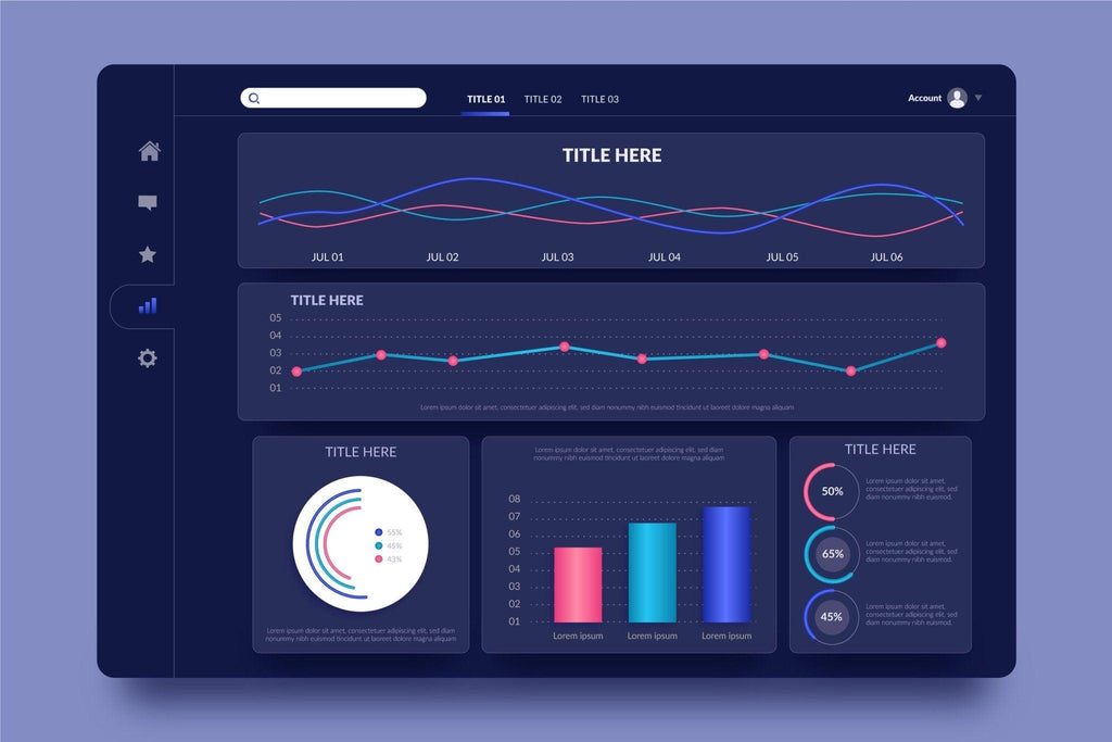
Every piece of data tells a story, and choosing the right visuals brings that story to life. KPIs and metrics shine through simple cards or gauge charts, making key insights stand out instantly. Line charts work well for tracking trends over time, while bar charts provide clear comparisons. For deeper analysis, scatter plots reveal patterns, and maps bring geographical data to life. Picking the right visual for each data point ensures clarity and impact.
Keeping Branding and Formatting Consistent
A report should not only function well but also look professional. Consistency in design builds trust and makes navigation intuitive. Sticking to a defined color palette reinforces brand identity, while uniform fonts and text sizes improve readability. Conditional formatting adds another layer of clarity, highlighting trends and outliers without overwhelming the viewer. Custom themes ensure every report feels cohesive and polished.
Making Reports Interactive
Interactivity transforms a static report into an engaging experience. Filters and slicers allow users to tailor the data to their needs. Drill-through pages provide deeper insights with just a click, offering details without cluttering the main dashboard. Buttons and bookmarks simplify navigation, creating a smooth user experience. When designed well, interactivity makes reports feel intuitive and dynamic.
Optimizing Performance
A report that takes too long to load loses its impact. Slow performance frustrates users and hinders decision-making. Optimizing performance starts with aggregating data instead of loading raw datasets. Efficient DAX calculations help prevent unnecessary processing delays. Reducing the number of visuals on a single page also improves speed, ensuring a smoother experience. For real-time data needs, Direct Query mode provides an option to access fresh information without sacrificing performance.
Common Performance Issues and Fixes
Large datasets and excessive visuals often lead to slow-loading reports. Compressing data and limiting visuals keeps things running smoothly. Complex calculations can slow things down too, so simplifying DAX formulas improves efficiency. Pre-filtering unnecessary data before importing it into Power BI reduces volume and speeds up processing. A well-structured data model ensures relationships remain efficient, keeping reports fast and responsive.
Testing and Gathering Feedback
Before rolling out a report, testing ensures it works as expected. Verifying data accuracy builds trust in the insights being presented. Checking how the report appears on different screen sizes ensures accessibility for all users. Gathering feedback from stakeholders highlights areas for improvement, refining the final version. Usability testing catches any potential roadblocks, ensuring the report is intuitive and easy to navigate.
Power BI Reports in Action with DataFlip
Power BI dashboards serve different purposes across industries, and DataFlip has made an impact by designing reports tailored to specific business needs. Whether tracking financial performance, measuring marketing success, monitoring workforce trends, or optimizing supply chains, well-crafted reports drive better decisions. A well-designed Power BI report is more than just charts and numbers, it tells a compelling story that turns data into action.
About the Author

Mandavi Yadav
A passionate writer exploring themes of culture, tradition, and devotion. Sharing timeless stories that inspire and connect. Bringing the essence of heritage to life through words.