



15 Power BI Dashboard Examples by Industry (2026): KPIs, Design Ideas & Use Cases
Posted on October 17, 2026

Contents
Power BI dashboards help businesses turn complex data into clear, actionable insights. From monitoring sales performance and financial health to tracking patient outcomes and supply chain efficiency, the right dashboard helps teams understand what is happening, identify trends, and make better decisions.
However, every industry has different reporting requirements. A sales manager needs visibility into revenue and targets, while a finance team focuses on profitability and cash flow. Healthcare organizations monitor patient flow, and manufacturing businesses track production efficiency and equipment downtime.
In this guide, we explore 15 Power BI dashboard examples by industry, including essential KPIs, recommended charts, business use cases, and practical design tips. Whether you are looking for inspiration for your next report or want to choose a ready-to-customize Power BI dashboard template, these examples will help you understand what to build and why.
What Is a Power BI Dashboard?
Microsoft Power BI is a business intelligence platform that helps organizations connect data from different sources, transform it into useful information, and create interactive reports.
In Power BI terminology, a dashboard is a single-page canvas available in the Power BI service, while a report can contain multiple pages with interactive charts, tables, filters, and other visualizations. In everyday business discussions, people often use the word “dashboard” to describe both.
A well-designed dashboard brings important business metrics together in one place. Instead of manually reviewing multiple spreadsheets, teams can monitor performance, compare results, and investigate changes through visual reports.
Common uses of Power BI dashboards include:
-
Monitoring key performance indicators (KPIs).
-
Tracking performance against business targets.
-
Identifying trends and unusual changes.
-
Comparing departments, products, regions, or time periods.
-
Improving operational efficiency and resource allocation.
-
Supporting data-driven business decisions.
15 Power BI Dashboard Examples by Industry
The following examples demonstrate how organizations can use Power BI to address different business challenges. Each example includes recommended KPIs, suitable visualizations, and the decisions the dashboard can support.
1. Power BI Sales Dashboard
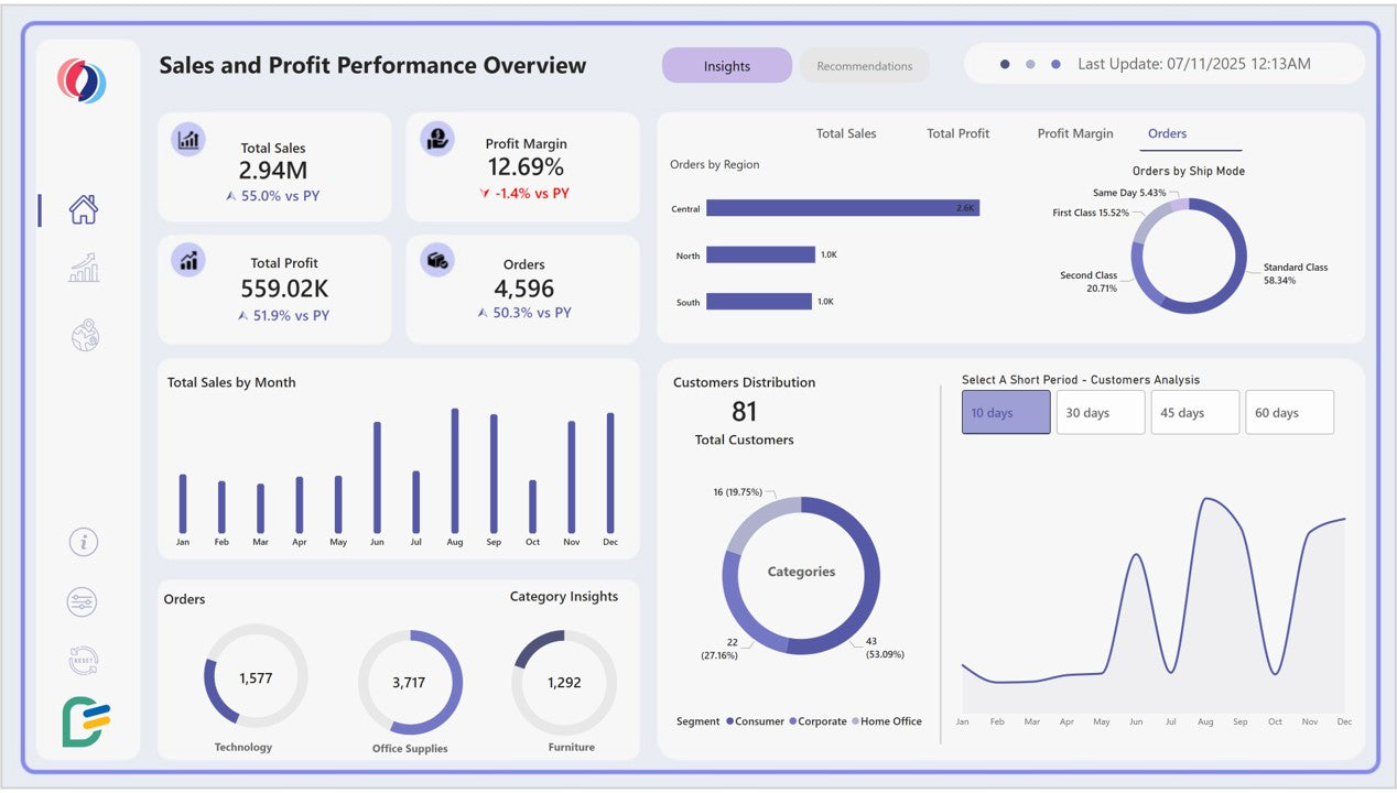
A Power BI sales dashboard helps sales teams monitor revenue, measure progress toward targets, and understand which products, regions, or sales representatives are driving results.
Sales managers can use it to identify underperforming territories, evaluate sales trends, and prioritize opportunities that need attention.
Essential KPIs
-
Total sales revenue
-
Sales growth rate
-
Sales target achievement
-
Gross profit and gross margin
-
Average order value
-
Sales by product, region, and representative
Recommended visualizations
-
KPI cards for revenue, growth, and target achievement.
-
Line charts to track sales over time.
-
Bar charts to compare regions and product categories.
-
Tables to review sales representative performance.
-
Maps to explore geographic sales distribution when location data is reliable.
Business use case: A regional sales manager notices that revenue has declined in one territory. The dashboard helps compare product performance, order volume, and sales representative results to identify where further investigation is needed.
Design tip: Place revenue, growth, and target achievement at the top of the page. Use consistent definitions for sales, returns, and reporting periods so that the figures remain comparable.
Find the Right Power BI Dashboard for Your Business
2. Power BI Financial Dashboard
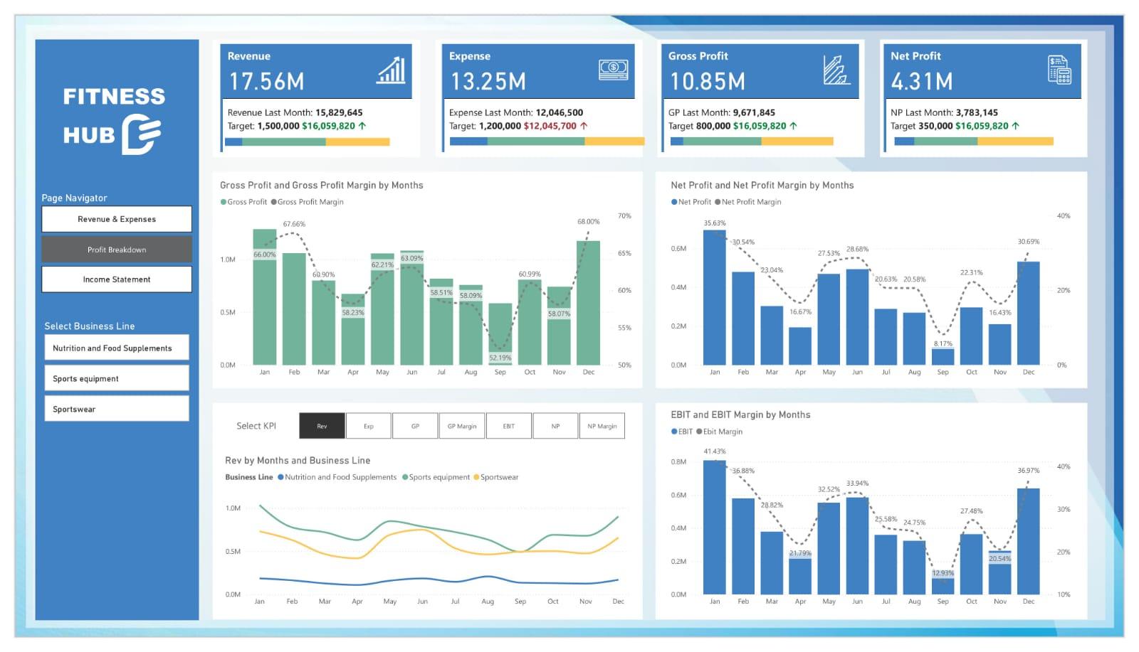
A financial dashboard gives finance teams and business leaders a consolidated view of profitability, expenses, cash flow, and budget performance.
It helps organizations compare actual financial results with budgets and investigate significant differences before they become larger problems.
Essential KPIs
-
Total revenue
-
Operating expenses
-
Gross profit and net profit
-
Operating profit margin
-
Operating cash flow
-
Budget variance
Recommended visualizations
-
KPI cards for major financial metrics.
-
Line charts for monthly revenue and expenses.
-
Waterfall charts to explain changes in profit.
-
Variance charts for actual versus budget.
-
Tables for detailed financial accounts and cost centers.
Business use case: A CFO wants to understand why operating profit is below budget. A financial dashboard can break down expenses by department, compare actual and planned spending, and highlight the areas that require review.
Design tip: Clearly distinguish actual, budgeted, and forecast figures. Use consistent reporting periods and document the definitions behind financial measures.
Find the Right Power BI Dashboard for Your Financial Industry
3. Power BI Marketing Dashboard
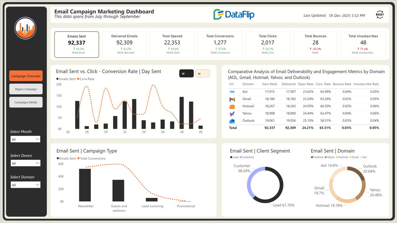
A marketing dashboard brings campaign performance data together to help marketers understand how advertising spend translates into traffic, leads, conversions, and revenue.
It is particularly useful for teams managing multiple channels, including paid search, paid social, email, organic search, and other digital campaigns.
Essential KPIs
-
Marketing spend
-
Impressions and clicks
-
Click-through rate (CTR)
-
Cost per click (CPC)
-
Cost per lead (CPL)
-
Conversion rate
-
Customer acquisition cost (CAC)
-
Return on ad spend (ROAS)
Recommended visualizations
-
Funnel charts for lead progression.
-
Line charts for campaign trends.
-
Bar charts for channel comparisons.
-
Scatter plots to compare spend and conversion performance.
-
Tables for campaign-level metrics.
Business use case: A marketing manager wants to understand which channels generate the most cost-effective leads. The dashboard compares spending, conversions, and lead quality across campaigns.
Design tip: Keep attribution models and conversion definitions consistent. A low cost per lead does not automatically mean a campaign generates more qualified leads or profitable customers.
Find the Right Power BI Dashboard for Your Marketing Industry
4. Power BI Healthcare Dashboard
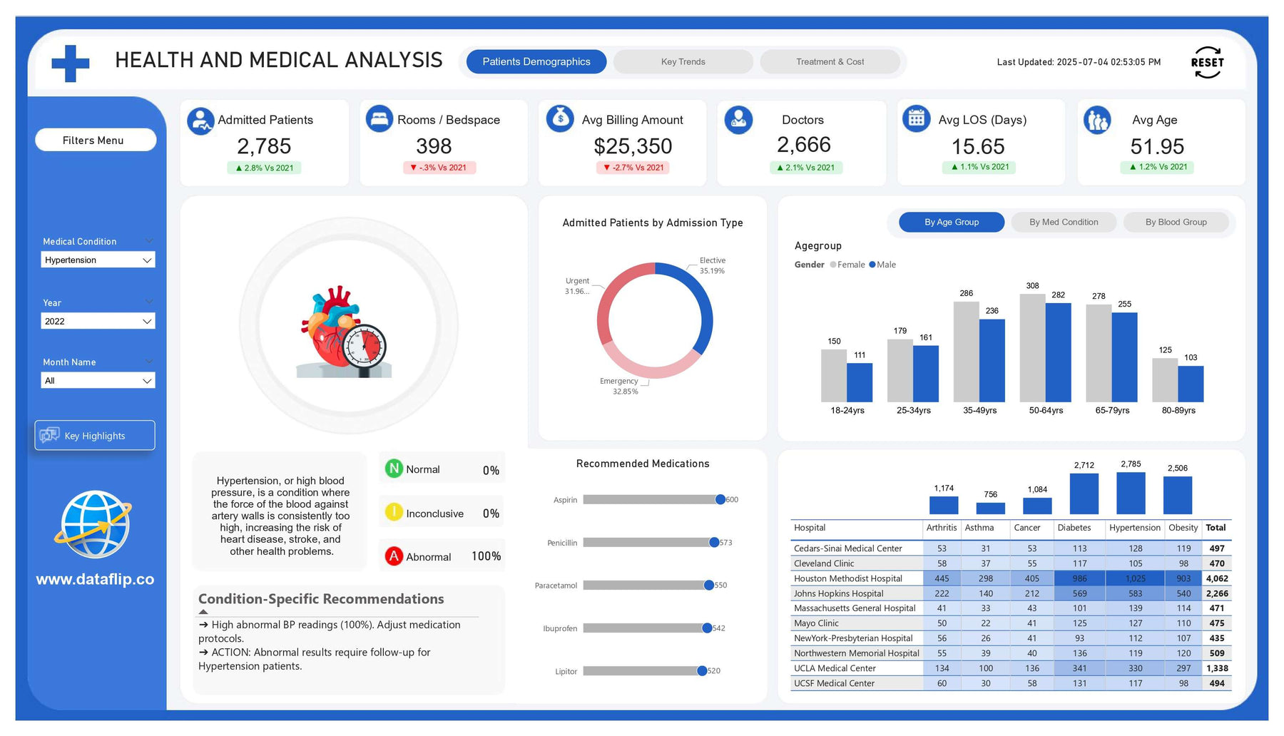
Healthcare dashboards help hospitals, clinics, and healthcare administrators monitor operational performance, patient flow, resource utilization, and service delivery.
The metrics selected should reflect the organization's responsibilities and the decisions its teams need to make.
Essential KPIs
-
Patient volume
-
Average waiting time
-
Bed occupancy rate
-
Average length of stay
-
Readmission rate
-
Appointment cancellation rate
-
Department-level patient throughput
Recommended visualizations
-
Line charts for patient volume trends.
-
Bar charts for department comparisons.
-
KPI cards for waiting times and occupancy.
-
Heatmaps for appointment demand by day and time.
-
Tables for operational summaries.
Business use case: A hospital administrator needs to identify periods of high patient demand. The dashboard compares admissions, waiting times, and available capacity to support staffing and resource planning.
Design tip: Protect patient information through appropriate access controls and data minimization. Operational dashboards should provide useful insights without unnecessarily exposing identifiable patient records.
Find the Right Power BI Dashboard for Your Healthcare Industry
5. Power BI HR Dashboard
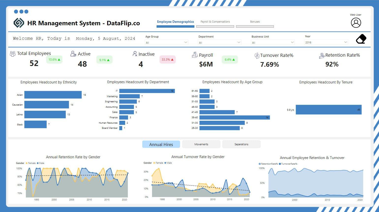
A human resources dashboard helps HR teams understand workforce composition, recruitment performance, employee retention, and staffing requirements.
It can support workforce planning by revealing trends across departments, job roles, locations, and employment periods.
Essential KPIs
-
Total headcount
-
Employee turnover rate
-
Employee retention rate
-
Time to hire
-
Cost per hire
-
Absenteeism rate
-
Training completion rate
Recommended visualizations
-
KPI cards for headcount and turnover.
-
Line charts for workforce trends.
-
Bar charts for department comparisons.
-
Recruitment funnel charts.
-
Cohort charts for retention analysis.
Business use case: An HR team observes an increase in employee turnover. A dashboard can help examine patterns by department, tenure, and job role, supporting a more focused investigation into retention challenges.
Design tip: Use clear metric definitions and restrict access to sensitive employee information. Avoid presenting correlations as proof that a particular factor caused employee turnover.
Find the Right Power BI Dashboard for Your HR Industry
6. Power BI Supply Chain Dashboard
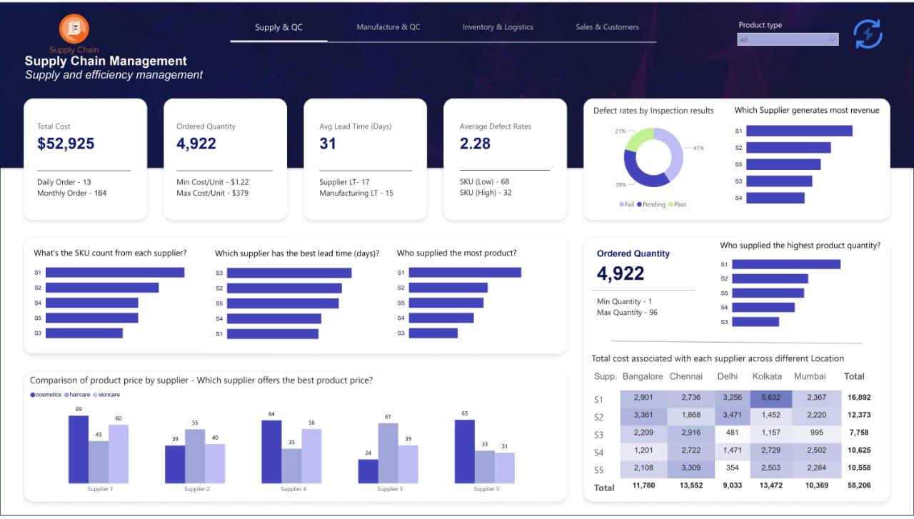
A supply chain dashboard provides visibility into inventory, suppliers, purchasing, delivery performance, and fulfillment operations.
It helps supply chain managers identify potential bottlenecks and balance product availability with inventory costs.
Essential KPIs
-
Inventory turnover
-
Stockout rate
-
Days of inventory on hand
-
Supplier lead time
-
On-time delivery rate
-
Order fulfillment rate
-
Inventory carrying cost
Recommended visualizations
-
Line charts for inventory and demand trends.
-
Bar charts for supplier performance.
-
Tables for stock levels and reorder requirements.
-
Heatmaps for warehouse activity.
-
Trend charts for delivery performance.
Business use case: A distributor experiences frequent stockouts for a popular product. The dashboard helps compare demand patterns, supplier lead times, and available inventory to identify possible causes.
Design tip: Include product identifiers, warehouse locations, inventory snapshots, and transaction dates in the data model. Inventory measures should account for the timing of stock movements.
7. Power BI E-commerce Dashboard
An e-commerce dashboard helps online retailers track store performance, order activity, product profitability, and customer purchasing behavior.
By combining order data with marketing and product information, businesses can better understand how customers move from browsing to purchasing.
Essential KPIs
-
Net sales
-
Total orders
-
Average order value
-
Conversion rate
-
Cart abandonment rate
-
Product return rate
-
Repeat purchase rate
-
Contribution margin
Recommended visualizations
-
Line charts for daily and monthly sales.
-
Bar charts for product and category performance.
-
Funnel charts for the purchase journey.
-
Tables for orders and returns.
-
Cohort charts for repeat purchasing.
Business use case: An online retailer sees an increase in sales but a decline in profitability. The dashboard helps examine discounting, returns, product margins, and marketing costs to understand the difference.
Design tip: Distinguish gross sales from net sales, and account for cancellations, refunds, discounts, and returns. This provides a more reliable view of store performance.
8. Power BI Retail Dashboard
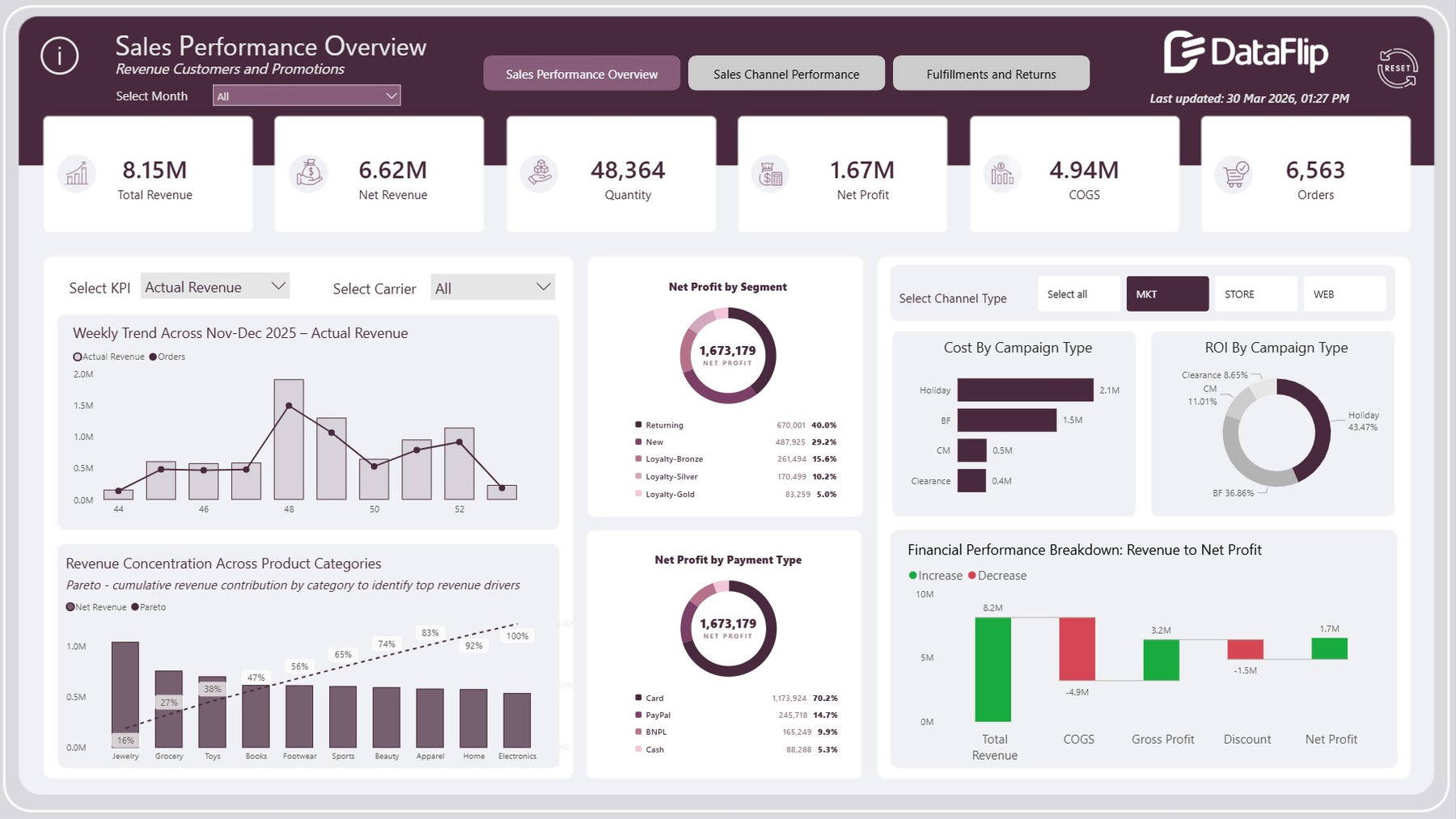
Retail dashboards help store managers and retail businesses compare locations, monitor inventory, analyze product categories, and understand customer purchasing patterns.
They are useful for businesses operating multiple stores or managing a broad product catalogue.
Essential KPIs
-
Total sales
-
Same-store sales growth
-
Gross margin
-
Units sold
-
Sell-through rate
-
Inventory turnover
-
Sales per square foot, where relevant
-
Return rate
Recommended visualizations
-
Bar charts for store comparisons.
-
Line charts for daily and seasonal trends.
-
Treemaps for product category contribution.
-
Tables for stock and sales performance.
-
Maps for store-level geographic analysis.
Business use case: A retail chain wants to understand why some stores consistently outperform others. The dashboard compares revenue, product mix, inventory availability, and store-level trends.
Design tip: Compare stores over equivalent time periods and account for store openings, closures, and differences in store size.
9. Power BI Real Estate Dashboard
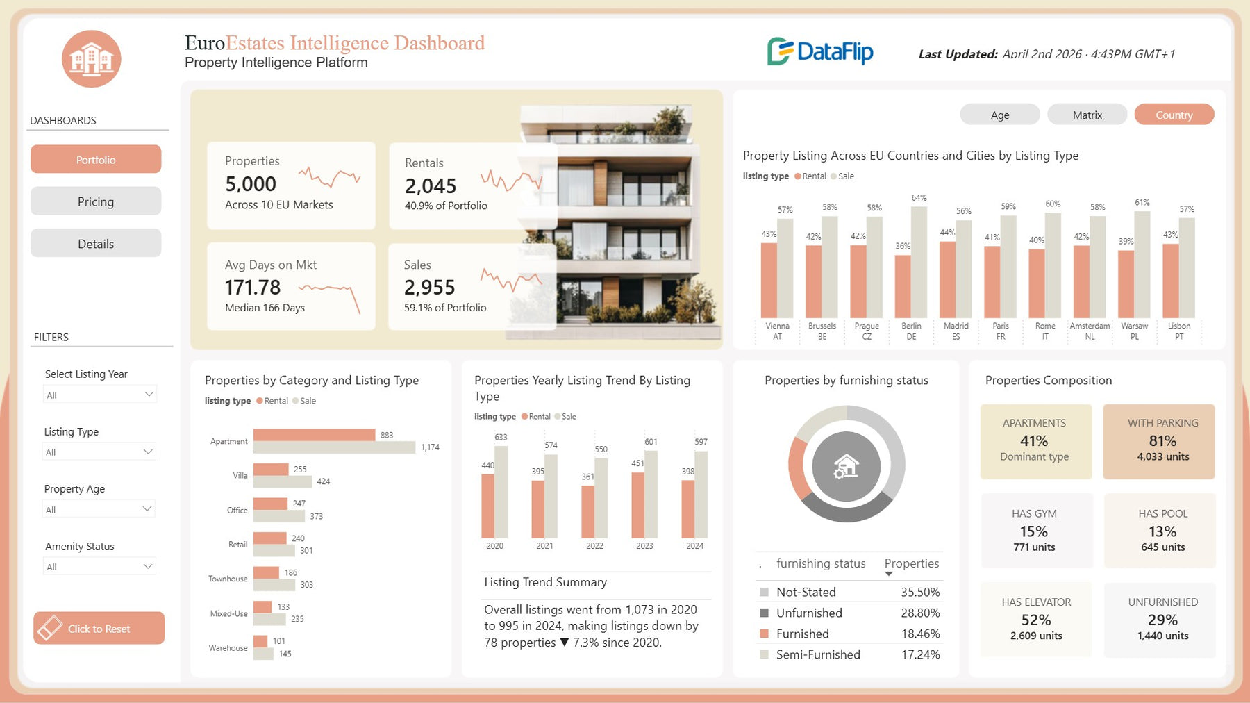
Real estate dashboards help property managers, brokers, investors, and developers monitor property performance, occupancy, rental income, and sales pipelines.
The dashboard can provide a consolidated view of individual properties as well as the overall portfolio.
Essential KPIs
-
Occupancy rate
-
Vacancy rate
-
Rental income
-
Rent collection rate
-
Average days on market
-
Sales pipeline value
-
Rental yield
-
Maintenance costs
Recommended visualizations
-
Maps for property locations.
-
Bar charts for property comparisons.
-
Line charts for rental income and occupancy trends.
-
Funnel charts for sales opportunities.
-
Tables for property-level performance.
Business use case: A property manager wants to identify assets with persistent vacancies. The dashboard compares occupancy, asking rents, property locations, and time on market to prioritize further investigation.
Design tip: Keep residential, commercial, and other property categories distinct where their financial measures are not directly comparable.
Find the Right Power BI Dashboard for Your Real Estate Business
10. Power BI Education Dashboard
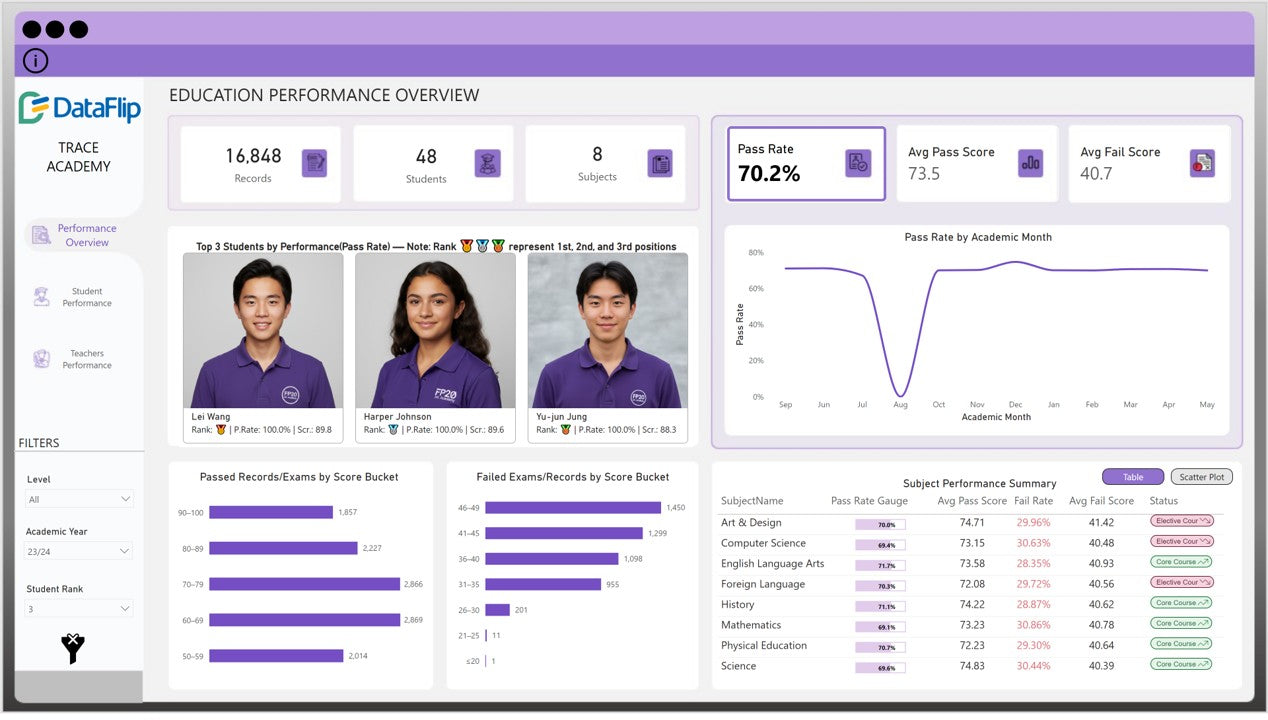
Education dashboards help schools, colleges, universities, and training providers monitor enrollment, attendance, academic progress, and student retention.
They support administrators and educators in understanding performance across courses, classes, and academic periods.
Essential KPIs
-
Student enrollment
-
Attendance rate
-
Course completion rate
-
Pass rate
-
Student retention rate
-
Graduation rate
-
Enrollment by program
Recommended visualizations
-
Line charts for enrollment trends.
-
Bar charts for course comparisons.
-
Heatmaps for attendance patterns.
-
Tables for academic performance summaries.
-
Cohort charts for retention and completion.
Business use case: A college notices that completion rates differ significantly across programs. The dashboard helps compare attendance, course progression, and retention patterns to identify areas that may need additional support.
Design tip: Use consistent academic periods and protect student information. Aggregate data where possible to make trends visible without exposing individual records unnecessarily.
Find the Right Power BI Dashboard for Your Education Industry
11. Power BI Manufacturing Dashboard
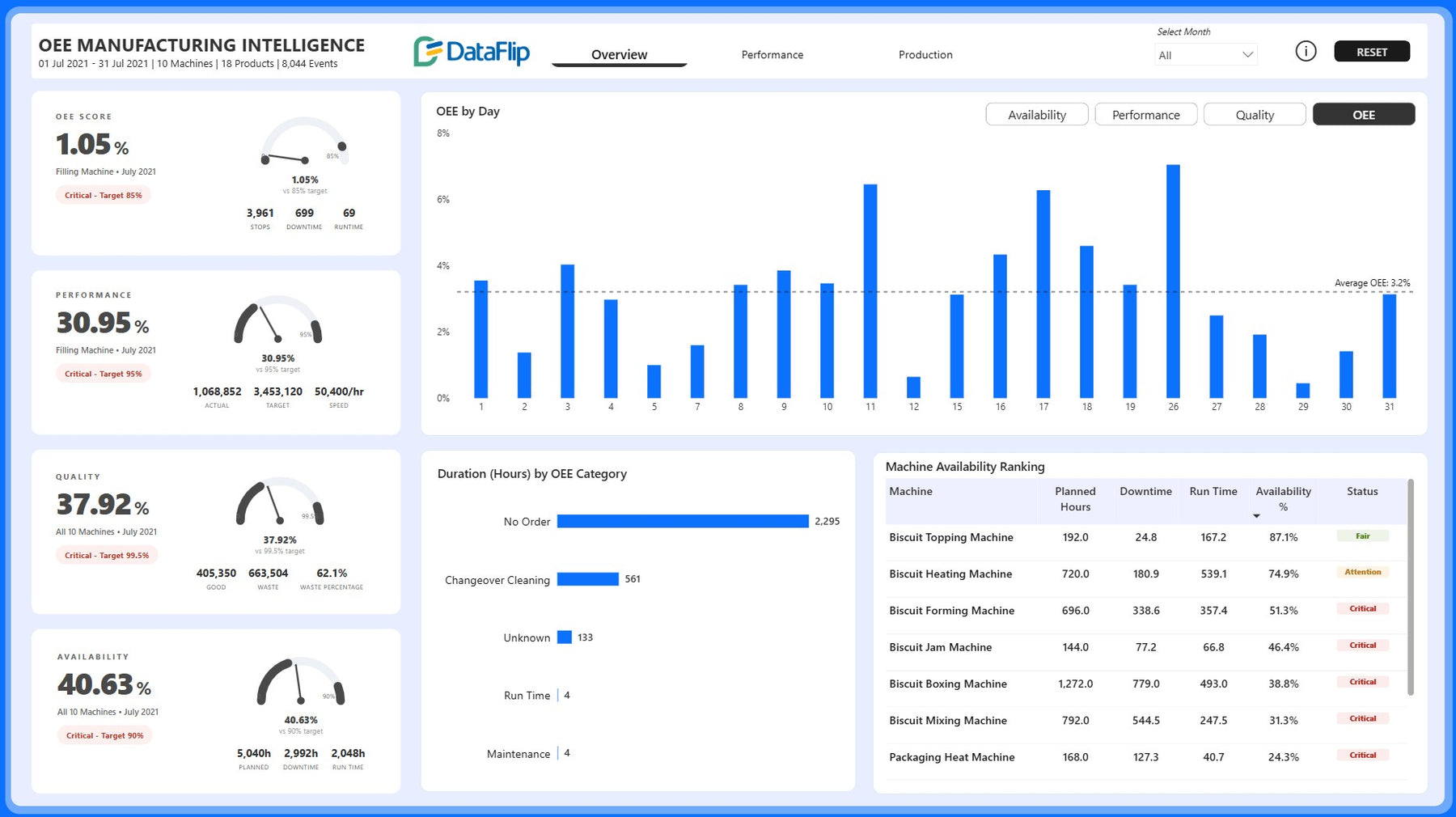
Manufacturing dashboards help production managers monitor factory performance, output, quality, equipment downtime, and production costs.
They provide visibility into operations across production lines, shifts, machines, and facilities.
Essential KPIs
-
Overall Equipment Effectiveness (OEE)
-
Production output
-
Defect rate
-
Scrap rate
-
Equipment downtime
-
Production cycle time
-
On-time production completion
Recommended visualizations
-
Line charts for output and downtime trends.
-
Bar charts for production line comparisons.
-
Pareto charts for defect categories.
-
KPI cards for OEE and quality.
-
Tables for machine-level performance.
Business use case: A manufacturer experiences repeated production delays. The dashboard compares downtime, shift performance, defect rates, and production output to help teams identify where to investigate.
Design tip: Define planned production time, downtime, availability, performance, and quality consistently when calculating OEE. Comparisons are only useful when the underlying definitions are aligned.
12. Power BI Logistics and Fleet Dashboard
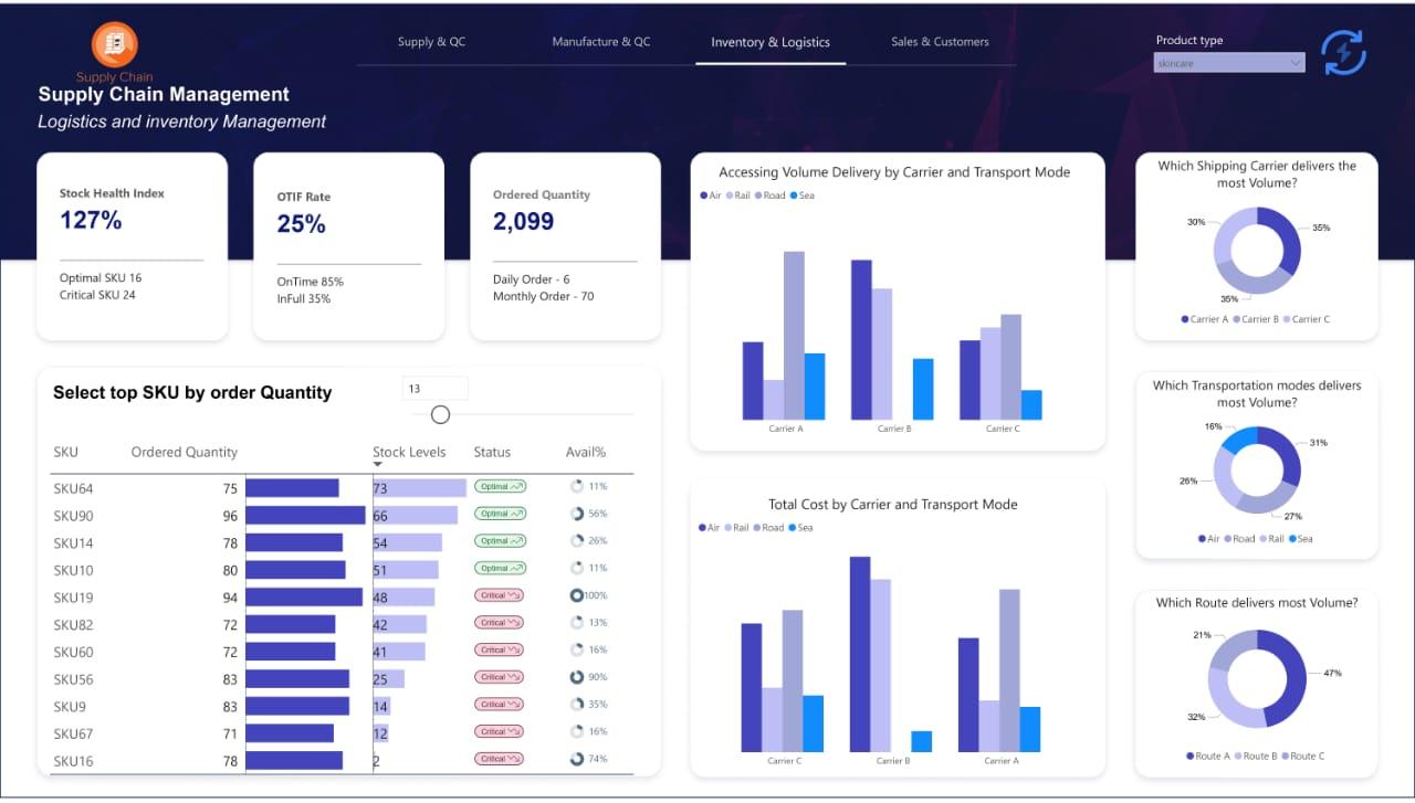
A logistics dashboard helps transportation companies, distributors, and delivery businesses track shipments, delivery reliability, vehicle utilization, and transportation costs.
It can combine shipment records, fleet information, route data, and delivery timestamps.
Essential KPIs
-
On-time delivery rate
-
Average delivery time
-
Cost per shipment
-
Vehicle utilization
-
Fuel consumption
-
Shipment delay rate
-
Order fulfillment rate
Recommended visualizations
-
Line charts for delivery performance.
-
Bar charts for carrier comparisons.
-
Maps for shipment locations and routes.
-
Tables for delayed deliveries.
-
Trend charts for fleet utilization.
Business use case: A logistics manager wants to reduce delivery delays. The dashboard compares routes, carriers, delivery windows, and shipment volumes to identify recurring operational issues.
Design tip: Use standardized timestamps and clearly define what counts as an on-time delivery. If GPS or route information is used, validate its completeness and accuracy.
13. Power BI Banking and Risk Dashboard
Banking and financial services dashboards help teams monitor portfolio performance, lending activity, credit risk, and operational trends.
The design should reflect the institution's reporting requirements and the controls needed to protect sensitive financial information.
Essential KPIs
-
Loan portfolio value
-
Delinquency rate
-
Non-performing loan ratio
-
Credit exposure
-
Loan approval rate
-
Deposit growth
-
Transaction volume
Recommended visualizations
-
Line charts for portfolio trends.
-
Bar charts for loan categories.
-
Tables for risk segmentation.
-
Heatmaps for portfolio concentration.
-
KPI cards for major financial indicators.
Business use case: A lending team wants to understand changes in delinquency. The dashboard segments the portfolio by product, loan vintage, and other approved risk categories to help identify patterns requiring review.
Design tip: Validate metric definitions, reporting dates, and risk classifications. Apply role-based permissions and appropriate governance when handling financial or customer data.
14. Power BI Project Management Dashboard
Project management dashboards give project managers and business leaders visibility into schedules, budgets, milestones, resources, and delivery risks.
They are especially useful for organizations managing multiple projects or coordinating teams across departments.
Essential KPIs
-
Project completion percentage
-
Schedule variance
-
Budget variance
-
Milestone completion rate
-
Resource utilization
-
Overdue tasks
-
Project risk status
Recommended visualizations
-
Gantt-style timelines for schedules.
-
KPI cards for budget and completion.
-
Bar charts for project comparisons.
-
Tables for milestones and overdue tasks.
-
Risk matrices for project issues.
Business use case: A program manager needs to identify projects that may miss their deadlines. The dashboard compares planned milestones with actual progress, highlights delays, and shows resource constraints.
Design tip: Establish consistent rules for calculating project progress. A project marked 80% complete may still be at risk if its remaining work contains critical milestones.
15. Power BI SaaS and Technology Dashboard
SaaS and technology dashboards help software businesses monitor recurring revenue, customer retention, product adoption, and service reliability.
They connect commercial performance with customer behavior and operational metrics.
Essential KPIs
-
Monthly recurring revenue (MRR)
-
Annual recurring revenue (ARR)
-
Customer churn rate
-
Revenue churn rate
-
Customer retention rate
-
Customer acquisition cost
-
Customer lifetime value
-
Service uptime
Recommended visualizations
-
Line charts for recurring revenue trends.
-
Cohort charts for customer retention.
-
Bar charts for plan and customer segment comparisons.
-
Funnel charts for product adoption.
-
KPI cards for churn and service availability.
Business use case: A SaaS company notices that new customer acquisition is increasing while recurring revenue growth remains slow. The dashboard helps examine churn, subscription downgrades, plan mix, and customer retention.
Design tip: Define MRR, ARR, churn, and retention consistently. Explain whether revenue metrics include discounts, cancellations, upgrades, downgrades, or one-time charges.
Power BI Dashboard Examples: Industry Comparison
The following table summarizes the main purpose and metrics for each dashboard type.
| Industry | Primary purpose | Key KPIs |
|---|---|---|
| Sales | Monitor revenue and targets | Revenue, growth, target achievement |
| Finance | Measure financial health | Profit, expenses, cash flow |
| Marketing | Evaluate campaign performance | ROAS, CPL, conversion rate |
| Healthcare | Improve operational visibility | Patient volume, waiting time, occupancy |
| HR | Monitor workforce performance | Headcount, turnover, time to hire |
| Supply chain | Improve inventory and delivery | Stockouts, lead time, inventory turnover |
| E-commerce | Understand online store performance | Net sales, orders, returns |
| Retail | Compare stores and products | Same-store sales, margin, sell-through |
| Real estate | Monitor property performance | Occupancy, rental income, vacancy |
| Education | Track student outcomes | Enrollment, attendance, completion |
| Manufacturing | Improve production efficiency | OEE, defects, downtime |
| Logistics | Monitor transportation performance | On-time delivery, cost per shipment |
| Banking | Monitor lending and risk | Delinquency, exposure, portfolio value |
| Project management | Track delivery and budgets | Schedule variance, budget variance |
| SaaS and technology | Measure recurring revenue and retention | MRR, churn, retention, uptime |
How to Choose the Right Power BI Dashboard
The best dashboard is not necessarily the one with the most charts. It is the one that helps its intended users answer important business questions quickly.
Consider the following factors before selecting a dashboard template or designing a new report.
1. Define your business objectives
Start by identifying the decisions the dashboard should support. For example, a sales dashboard may help managers improve target achievement, while an inventory dashboard may help reduce stockouts.
Every major visual should serve a specific reporting need.
2. Identify your target users
Executives, managers, and operational teams need different levels of detail.
An executive dashboard may prioritize a small set of high-level KPIs, while an operational dashboard may require detailed tables, filters, and drill-through functionality.
3. Check your available data
Review the data sources before committing to a design. Common sources include Excel files, SQL databases, ERP systems, CRM platforms, accounting software, and marketing platforms.
Make sure the necessary fields exist, the data can be refreshed reliably, and metric definitions are consistent.
4. Select the right KPIs
Avoid adding metrics simply because they are easy to calculate. Choose KPIs that connect directly to your objectives and that users can interpret correctly.
For each KPI, document its definition, calculation, reporting period, and intended use.
5. Choose appropriate visualizations
Use line charts to show changes over time, bar charts to compare categories, tables for detailed values, and scatter plots to explore relationships between measures.
Maps should be used when geographic information provides meaningful insight. Avoid unnecessary visual complexity.
6. Consider customization and scalability
A template may provide a useful starting point, but your business may need different measures, data connections, filters, branding, or security rules.
Before selecting a template, check its compatibility with your Power BI environment and the amount of customization required.
How to Build a Power BI Dashboard Step by Step
If you want to create an industry-specific dashboard from scratch, follow this process.
Step 1: Connect your data sources
Import or connect to the systems that contain the required information. Depending on your use case, this might include Excel, SQL databases, CRM data, or an ERP system.
Step 2: Clean and transform the data
Use Power Query to address missing values, remove duplicates where appropriate, standardize formats, and prepare the data for analysis.
Step 3: Create a data model
Establish relationships between relevant tables. A well-designed model helps keep calculations consistent and improves report maintainability.
Step 4: Create DAX measures
Define the KPIs the dashboard needs, such as total revenue, profit margin, sales growth, or inventory turnover. Validate the measures against known business figures.
Step 5: Design the report layout
Place the most important KPIs prominently. Organize the remaining visuals into logical sections, use consistent formatting, and avoid overcrowding the page.
Step 6: Add filters and interactions
Include relevant slicers and drill-through features so users can explore the information by date, region, department, product, or another meaningful dimension.
Step 7: Validate and publish
Compare results with source data, test filters and calculations, review access permissions, and publish the report to the appropriate Power BI workspace.
Step 8: Configure refresh and maintenance
Set up an appropriate data refresh process, monitor failures, and review KPI definitions as business requirements evolve.
Power BI Dashboard Design Best Practices
A dashboard should communicate information clearly without forcing users to search through unnecessary visuals.
Follow these practices to make your reports more useful.
-
Prioritize important metrics: Put the most decision-relevant KPIs near the top of the page.
-
Use a consistent visual hierarchy: Apply consistent fonts, spacing, titles, and number formats.
-
Choose charts carefully: Use visuals that make comparisons and trends easy to understand.
-
Limit unnecessary colors: Use color consistently to communicate meaning rather than decoration.
-
Provide useful context: Show targets, previous periods, or benchmarks where appropriate.
-
Use clear labels: Explain metrics and avoid unexplained abbreviations.
-
Optimize for performance: Avoid unnecessarily complex models, excessive visuals, and inefficient calculations.
-
Design for accessibility: Maintain readable text, adequate contrast, and alternatives to color-only indicators.
-
Test interactions: Make sure slicers, filters, and drill-through features behave as expected.
-
Protect sensitive information: Apply appropriate permissions and row-level security when required.
Should You Build a Dashboard From Scratch or Use a Template?
Building a dashboard from scratch provides flexibility, but it also requires time for data preparation, modeling, calculations, design, testing, and ongoing maintenance.
A ready-to-customize Power BI dashboard template can provide a starting layout and reporting structure. However, the actual time savings depend on how well the template matches your data and business requirements.
Consider the differences below.
| Factor | Build from scratch | Use a template |
|---|---|---|
| Initial design | Fully customized | Starts with an existing layout |
| Development effort | Usually higher | May be lower when the template fits |
| KPI definitions | Designed for your requirements | Must be reviewed and adapted |
| Data connections | Configured for your systems | Compatibility varies |
| Customization | Complete flexibility | Depends on the template |
| Maintenance | Your team manages it | Your team may still need to maintain it |
Before choosing a template, check what is included, whether the data model and measures are supplied, which data sources are supported, and what changes are needed to make the dashboard work with your business data.
Explore DataFlip's Power BI dashboard templates to find a starting point for your reporting needs.
Frequently Asked Questions
1. What are the best Power BI dashboard examples by industry?
Useful examples include sales, finance, marketing, healthcare, HR, supply chain, e-commerce, retail, real estate, education, manufacturing, logistics, banking, project management, and SaaS dashboards. The best option depends on your business objectives, users, and available data.
2. What should a Power BI dashboard include?
A well-designed dashboard should include relevant KPIs, appropriate visualizations, meaningful comparisons, clear labels, and useful filters where needed. It should help users answer specific business questions without unnecessary complexity.
3. Which KPIs should I include in a Power BI dashboard?
Choose KPIs based on your industry and reporting goals. Sales teams may monitor revenue and target achievement, finance teams may focus on profitability and cash flow, and HR teams may track headcount and employee turnover. Every KPI should have a clear definition.
4. Can I use a Power BI dashboard template for my business?
Yes. A suitable template can provide a useful starting point, but you may need to customize its measures, data connections, layout, and filters. Always verify compatibility with your data and Power BI environment.
5. Can I connect Power BI to Excel and SQL databases?
Yes. Power BI supports Excel and many database connections, including SQL Server. Other sources may be supported through built-in connectors, APIs, or additional integration methods. The appropriate approach depends on your source system and refresh requirements.
6. What is the difference between a Power BI dashboard and a report?
A Power BI dashboard is a single-page canvas in the Power BI service. A Power BI report can contain multiple pages and interactive visualizations. Reports generally provide more detailed exploration, while dashboards offer a consolidated overview.
7. How often should a Power BI dashboard refresh?
The refresh schedule depends on how frequently the underlying data changes and how quickly users need updated information. Some reports can use scheduled refreshes, while other scenarios may support more frequent updates or DirectQuery. Technical limits depend on the data source and configuration.
8. How do I make a Power BI dashboard more effective?
Start with clear business objectives, choose meaningful KPIs, select appropriate charts, keep the layout simple, validate calculations, and test the report with its intended users. Review performance and usability regularly.
9. Are Power BI dashboard templates customizable?
Most templates are intended to be adapted, but the level of customization varies. Review the included files, data model, measures, visualizations, and license terms before using a template.
10. How do I choose the right Power BI dashboard for my industry?
Identify the decisions your team needs to make, determine the relevant KPIs, check your available data, and select a layout that supports those requirements. Compare templates based on functionality, compatibility, and customization needs rather than appearance alone.
Final Thoughts
Power BI dashboards can help businesses improve reporting, monitor performance, and make more informed decisions. However, the most useful dashboard is one that reflects the organization's actual goals, data, and workflows.
From sales and finance to healthcare, manufacturing, retail, and SaaS, each industry requires a different combination of metrics and visualizations. Start with a clear business objective, select the KPIs that matter, and build a report that makes the next action easier to identify.
If you want to explore existing layouts before building your own, browse DataFlip's Power BI dashboard templates and identify a suitable starting point for your business intelligence needs.
About the Author


